Role of Wireframes in Mobile Application Development
Prior to starting coding an app, wireframing is one of the most critical stages of the product development lifecycle. It defines for all parties how a mobile application will be utilized.
Given the popularity of wireframes in mobile app development, it’s essential for you (as a stakeholder) to understand why they’re important and why you shouldn’t skip them.
Let’s begin by understanding what a wireframe is and why it’s essential.
So without further ado, let’s get started!
What is Mobile App Wireframes?
A mobile app wireframe is a two-dimensional sketch that acts as a visual guide and illustrates how an application operates.
What a wireframe doesn’t illustrate is the entire application design; rather, it includes key screens and interface elements. An app owner and development team may use a wireframe to determine and outline the entire project’s direction and scope.
Though wireframing was originally limited to web design and Computer-Aided Design (CAD), gradually, it has become an essential part of app development.

In the initial phase, a wireframe is a low-fidelity design and omits to contain logos, actual pictures, and font specifications. Instead, it is essentially similar to an architectural plan or schematic diagram in appearance.
Graphic designers use gray lines, boxes, shapes, and placeholders to create a comprehensible visual presentation for mobile app wireframes.
Types of Wireframes
Following are the key building blocks of a wireframing process which also make the type of wireframes:
1. Low-Fidelity Wireframes
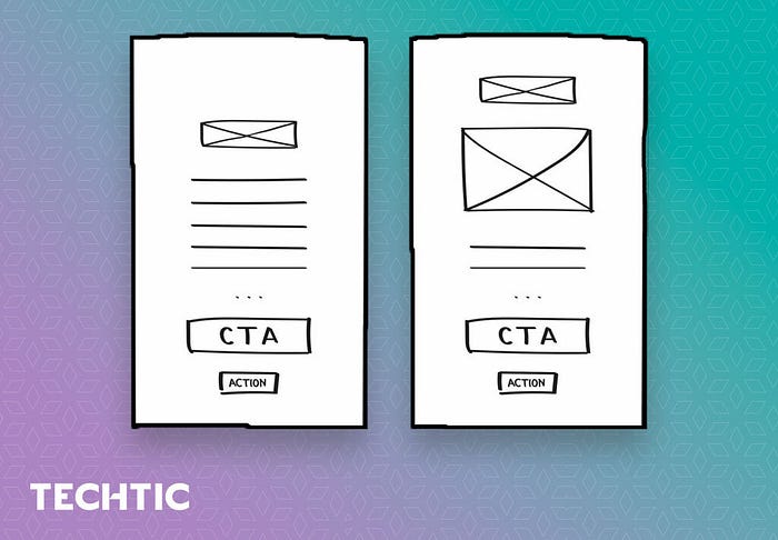
Low-fidelity wireframes are created either by hand or with a digital tool. It is important to note that these wireframes are created quickly and unsystematically, without any design elements whatsoever.
Although there are paper templates for creating wireframes by hand, it is a matter of personal preference whether you use a tool. To create low-fidelity wireframes online, there are several low-fidelity templates and kits available.

The primary idea behind a low-fidelity wireframe is to be as simple as possible. Designers only use grayscale, one generic font, and no images or design effects such as shadows.
2. Mid-Fidelity Wireframes
A mid-fidelity wireframe is more complex than a low-fidelity wireframe and closer to the final UI design. The wireframe may include pictures, more precise representations of the layout, and pages linking to one another, more elaborate and clear than in a low-fidelity wireframe.

The mid-fidelity wireframe can either be a continuation and refinement of a low-fidelity wireframe or the first step. For example, it isn’t necessary to create a low-fidelity design first and then jump on the mid one.
3. High-Fidelity Wireframe
The finest level of wireframing is referred to as high fidelity. This type of wireframe is the closest to the final UI design. UI elements, images, icons, colors, fonts, buttons, and backgrounds are all present in the high-fidelity wireframe and ready to be converted into a working prototype.

It is not always best to begin a UX/UI job with a high-fidelity wireframe. If you don’t have a strong foundation with a low-fidelity wireframe that has been tested for usability or has undergone several revisions, you can’t create the best high-fidelity wireframe.
What Should There Be in a Wireframe?
Different designers approach wireframing differently. For instance, a low-fidelity wireframe and a high-fidelity wireframe differ in terms of the complexity and precision of the illustrations.
Regardless of the model selected, every standard mobile app wireframe must include specific design elements. The following are the ones that’ll always be there:
- App features
- Content hierarchy & spacing
- User action buttons
- Transitions between pages
Moreover, most designers use only grayscale for wireframes. This means that the designers will have to shade a lot, using lighter grays for lighter colors and darker ones for darker ones.
However, in some high-fidelity wireframes, you may occasionally see color too. Red and blue, for example, are often used to convey warnings and suggestions, respectively.
Use of Wireframes in Mobile App Development
Having a proper wireframe prior to development will certainly help your mobile app project. If a wireframe is done correctly, it bridges the seemingly huge gap between your initial thought process and the finished user-focused product.
The following two are the key benefits of wireframing in mobile app development:
Helps Create Optimal User Flow
The greatest advantage of wireframing is that it gives you a comprehensive view of your customer journey.
If you want superb UX, you must think about user flow. If it is difficult for users to move from one location in their application to another, they may give up.
You can accomplish more with a wireframe than with a visualization of your user journey since you can eliminate the number of steps.
Saves Time on Design and Code Overhaul
Creating a wireframe is quick and inexpensive, especially when it comes to low-level UI/UX design elements. Whether you choose pen and paper or digital wireframing, there are plenty of resources that can help you finish a wireframe screen in a matter of hours or even minutes.
It is possible to make alterations to an app wireframe at no cost or for a minimal cost; in contrast, you will need a lot of time and money to redesign or rewrite the entire code.
How to Create Wireframes for Your Mobile App
The benefits of wireframing seem promising enough, but what’s the best approach to create them?
Here is how:
1. Map Out the Desired User Flow
Before beginning wireframing, you must have a clear notion of how many screens you’ll have to design and how users will interact with them. Having a tangible user flow can help you obtain this understanding.
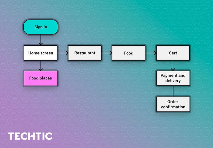
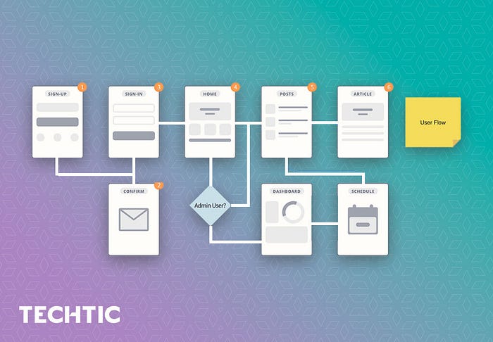
The user goal is critical to understanding user flows as it describes the path a user takes to reach a specific goal. To achieve a certain objective, users may pursue a variety of paths; therefore, user flows are rarely linear. User flows will help you determine what wireframes you should develop and how they should be connected.
User flows can be visualized using simple objects such as boxes and arrows. Here is an example:

2. Sketch Out the User Flow
After you have determined the user experience, it’s time to visualize it. The best practice is to abstain from using digital prototyping tools at this phase. Your creativity should be allowed to flourish as you explore various design options. In many cases, using paper or digital sketching tools is more efficient.
Here is an example of a home screen:

3. Set a Mobile Frame
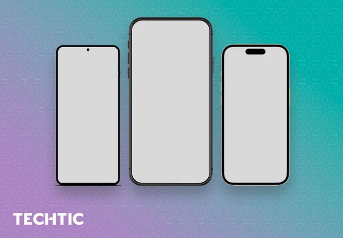
Although a simple rectangle frame is a decent alternative to using a real device frame, using an actual device frame is much better. By using a frame, you’ll be prevented from putting too many elements on the screen. Additionally, you’ll create an illusion of an actual design.
Usually, you must design for a variety of devices. But beginning with a device with medium screen size is recommended. For example, if you create an iOS app in 2022, you might use an iPhone 14 frame.

4. Determine Layout with Boxes
When you’re designing a wireframe, you should start by establishing a clear visual hierarchy — setting up the layout and structure. At this phase, you should not be concerned with the content itself; rather, you should consider how it is presented.
Begin by drawing boxes on the canvas in order to plan the layout according to how you want your visitors to process the information.
Prioritize the order in which you want to present information to your users. People scan web pages and smartphone screens from top to bottom and left to right, so keep that in mind.

5. Use Familiar Design Patterns
Designing an excellent UX is mainly dependent on creating a familiar experience. When people see familiar UI components in a fresh product, they can rely on their past knowledge when interacting with it.
Design patterns are part of both Android and iOS’s native styles and facilitate the creation of a familiar experience for designers. They may be used to address common issues (such as global navigation).
The following three are common patterns for top-level mobile navigation: bottom tab bars, Floating Action Buttons (FABs), and side drawers. Hence, consider using one of these patterns if you want to design clear and simple navigation paths in your app.
6. Bring in Your Copy
Once you’ve finalized the visual hierarchy, replace the dummy text and placeholders with real content (actual text or text that’s relevant to the user, though it doesn’t have to be the final copy).
For technical reasons, you should avoid dummy text at this stage — Lorem Ipsum doesn’t tell us how the page supports users in accomplishing their objectives.
Because a lot of the visual elements you create are based on the content you include in the app, we’ll also notice that some UI elements (or even UI sections) aren’t necessary for your app as you start adding real content.
Moreover, when you add real content to your wireframes, you may discover that the layout needs to be fixed. In this scenario, it’s critical to iterate and discover a better approach to conveying the information you want to communicate.

7. Check Design Responsiveness
It’s fine to start with a medium-sized phone screen like the iPhone 14 plus when wireframing, but it’s also important to see how content looks on both smaller and larger screens to ensure a great user experience.
So, try your wireframes on all the screen dimensions you’ve chosen.
Top Mobile App Wireframing Tools
As said earlier, there are several tools available that help your designers create stunning mobile app wireframes. The following are the top ones:
- Adobe XD
- Sketch
- Figma
- MockFlow
- UXPin
- Justinmind
Wrapping Up
Having a good app wireframe helps you better understand your app and its target user. It also optimizes the amount of time and resources you spend on design.
So, before jumping on developing your mobile app or creating prototypes, make sure you have your wireframes in place.
